Blog

Updates about the Archispeak Podcast beyond the episodes.

You Need to Pass the Architect's Registration Exam

The AIA National Convention is going on this week in Chicago, and Archispeak is there in spirit. Our profession really needs smart people to become architects. A lot of our listeners, while very good looking, are students or unlicensed professionals. Hell, two of our hosts are unlicensed. But not for long! That will change very soon. We need to dig in, get out hands dirty, and create the change we want. The first step is make sure we are on the same playing field as everyone else.

We've been talking about a lot lately on the podcast about the NCARB exams, what's involved in them, and what's changing. We've also talked a little bit about what tools are available to help us pass them. Friend of the show, David Doucette, has a great little company that makes study tools for the exams, and you can now help the podcast out by using our affiliate link when you purchase his materials. 

We have listeners who have used his materials and they rave about them. On top of the affordable study guides for the exams administered by NCARB, David's company Architect Exam Prep also has a study guide, which is more of a bible really, for the California Supplemental Exam. You'll see an image on the right side of most of our pages linking to these materials. If you are licensed, thanks for reading this far. Please pass this info along to your unlicensed friends. This is an amazing resource, and we hope you'll check it out.

You can find out more here.

Comment Rules: Be cool like the Fonz. Critical is fine, but if you’re rude, we’ll delete your stuff. Please do not put your URL in the comment text and please use your PERSONAL name or initials and not your business name, as the latter comes off like spam. Have fun and thanks for adding to the conversation!
In Tags , ,

More on Moleskine from Steve Hall

Listener Steve Hall posted an exhaustive commentary on his perfect sketching setup in the comment section of episode 22. With his permission, we've reposted it here for good measure so more people can read it. It's worth its weight in gold.

It's probably a good idea to listen to the episode first to understand why he felt compelled to tell us about his setup because we totally geeked-out on our favorite tools for sketching. At the end of the episode we asked what your favorite tools are that you use. So thanks to Steve for sharing.

We've also added links so you can check out his tools for yourself.


Great conversation! Nobody is "good" or "bad" at sketching, you have either practiced a lot or not much. Sketching is a means to exploring design, although they can also be beautiful by themselves.

I used to try and segment work from play, and notes from sketches. No more, I now put everything in one place in serial order. It makes a great reference that I always have with me. I don't know how many times I've referred to field drawings, meeting minutes or a design exploration in a meeting or conversation and been glad it was all together. Before resolving to do this, most of the sketches and notes I created on napkins and other found paper were regrettably lost to the ages.

I've been sketching in some form since the 1970s with a lot of experimentation along the way. It continued to refine up to five years ago when I discovered the final key to my "sketching rig." I'll share my specifications in case it helps anyone else.
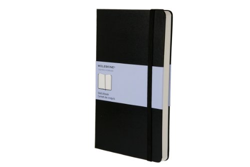
NOTEBOOK

Moleskine ("mole skin") Sketchbook, "Large" (5" x 8 1/4"), in the Creativity Notebooks collection. It has a pale blue/lavender packaging wrap. ($17.00)

I used my first one in 2005 and never looked back. The pages are super heavy and prevent even the heaviest of inks from visibility on the opposite side. I was previously a one-side only sketcher, but this notebook is the first one with pages so heavy and card-like that the other side is truly invisible. This one feature doubled the potential size of my sketches...

Opposing face sketching on this half-size notebook (despite Moleskine calling it "Large") presents a Letter size sketching surface. That's large enough for plenty of exploration while still keeping the notebook small to carry in any situation. But what about the binding down the middle?

The Sketchbook binds adjacent pages so that there is only a tiny seam down the middle. No matter if it is the first page or the last, opposing pages are almost perfectly flat and present little visual or textural barrier between the two faces.

  • Acid-free paper keeps pages fresh for decades, even centuries (with the right ink).
  • Corners are very slightly rounded so there are no dog ears.

Each book has a bookmark and a separate elastic closure band on the edge to keep it from coming open in transit. This is ideal to help keep loose items inside, too. (For fun, I keep four-leaf clovers I find at the page current when found, and also keep a few business cards loose inside the back cover for quick retrieval.) I sometimes use the elastic band as a bookmark so I can quickly open and close the book to the current page. Then the bookmark can be for some important page prior. There is also a pocket in the back for holding additional flat items in which I simply keep a few more business cards.

The binder is black. I use a silver permanent marker to write the year of completion on the binding so I can reach for the right one on a shelf for reference.

Make sure you get the "Sketchbook" model. I mistakenly purchased the more common green-wrapped "Notebook" at an office store and the pages are only half as thick and bleed. They don't lie as flat either although the paper is a tad whiter.

The only improvement I would ever want is maybe a page color that is more white. The pale cream color looks nostalgic and doesn't bother me, but I'd prefer true white if I could have it.

PEN

Hero 616 Extra Light Fountain Pen ($1.50 each)

(Here's the Amazon link. Ebay is a little bit hit and miss.)

Forget the fancy gold nib, these are terrific pens that are super cheap and refillable. Hero has been made in China for decades and have an arrow-shaped clip similar to another popular pen manufacturer. You can find packs of 10 on Ebay for $14.50 in three colors. The best part is that you don't care if you loose it, can have extra sitting around, and don't worry about anybody else using it. The friction on the paper is not as silky smooth as a gold nib, but smooth nonetheless. I like a little friction like a pencil. In combination with the smooth Moleskine Sketchbook paper, I think it is a great balance.

These pens are bullet proof. I've dropped them on the nib with no effect. They allow great flow of ink for blobby dots and stippling but also well perform that special quality of a fountain pen where thinner lines can be created by rotating the pen almost vertically, perpendicular to the paper. A fat and thin pen in one!

I often correct with Bic Wite-Out pens on trash paper (never the sketchbook!) and impatiently plow through fresh puddles with my Hero. Hasn't clogged yet.

These pens use a plastic squeezable refill reservoir. It is large and gives you plenty of notice before it runs out which is a good feature, but mine lasts a month. This does require the use of ink in a bottle, but that's a good thing...
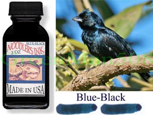
INK

Noodler's Ink, Blue-Black 19014 ($12.50)

This is the secret! Noodler's Ink has some very special qualities.

The first is that it is specifically designed for fountain pens. That means it doesn't dry in the pen, so there are no clogs. It also lubricates the parts so ink flows freely.

The second quality is that the ink becomes permanent and water proof after touching cellulose (paper). Really waterproof. I use it in water color Moleskine notebooks and literally wash my sketches with water and watercolor paints... zero bleed. It works well on trash paper and is smear proof in seconds. This would be a distinct advantage for a left-hander.

The third quality is Noodler's color selections. Most designers don't need a lot of colors, but they do want good colors. All of Noodler's colors are designer type colors, plenty of subtle shades to choose. I like Blue-Black because it is nearly pure black but has a very faint trace of being non-black so that original signatures and drawings differ from photocopies upon close inspection. I actually think the hint of blue makes the lines look darker beside pure black lines.

Although the bottle is $12.50 it will last... decades? I have no idea, I discovered Noodler's maybe four years ago and have barely made a dent in the bottle using it as my primary writing instrument the entire time. Maybe encourage colleagues to buy different colors and share around?

REFILLING

  1. Using a refillable pen and ink bottle takes two minutes and makes no mess if you just use a little common sense. Here's what I do, often in nice white shirts:
  2. Refill at an empty sink with some clear counter space for room to work. The one small risk is dropping the pen with ink, the splatter dots will be everywhere!
  3. Fold a fresh paper towel square once and put the ink bottle on it right next to the sink. This can catch drips, although I've honestly never dripped on it. It also provides a little traction so the glass bottle doesn't slide.
  4. Have a second paper towel ready to wipe the pen.
  5. Unscrew the pen barrel cover and open the ink bottle.
  6. Holding the pen by the squeeze button, dip the pen barely into the ink and squeeze the button 6-8 times and release.
  7. Turn on the sink water. Carefully move the pen over to dip the nib, pointed down, into the stream for a split second. The goal is to simply wash off the ink on the outside of barrel.
  8. Use the paper towel to dry the outside of the pen. Write a line with the nib on the paper towel to quickly draw out any ink at the tip that might be slightly diluted by the bath water.
  9. Done! Wash the inside of the pen cap if you want. Make sure to dry it out with a twisted corner of paper towel so any remaining water in the cap doesn't become a soggy inked mess all over the barrel.

SUMMARY

I've not had a single system failure in the four years I've been using Moleskine + Hero + Noodler's. This includes many plane flights, packing in travel bags, dropped pens, dusty conditions, rain, snow, drawing through Wite-Out, etc. Literally all the pens I've used in five years are still functioning, and I worry less about writing instruments than I ever have.

The sketchbook allows for Letter sized sketches, is small and portable, allows for quality drawings, and has a lot of nice little refined features. The pen and ink combination is great for spreading lots of ink in with a variety of line qualities, is waterproof, acid-free archival quality, quick drying, and very inexpensive.

Just like architecture, the tricks are in the details and the specifications. I hope this was useful to someone. Please drop me a line at SteveHallArchitecture if you have any comments.


Comment Rules: Be cool like the Fonz. Critical is fine, but if you’re rude, we’ll delete your stuff. Please do not put your URL in the comment text and please use your PERSONAL name or initials and not your business name, as the latter comes off like spam. Have fun and thanks for adding to the conversation!

The Business of Architecture

 “Friend of the Show” Enoch Sears, AIA was kind enough (or foolish, you decide) to invite Archispeak to appear on The Business of Architecture Podcast. We sat down and discussed social media for architects, architect’s websites, and creating good architecture.

Read More
Comment Rules: Be cool like the Fonz. Critical is fine, but if you’re rude, we’ll delete your stuff. Please do not put your URL in the comment text and please use your PERSONAL name or initials and not your business name, as the latter comes off like spam. Have fun and thanks for adding to the conversation!

New technology + Archispeak = Sound job advice for a friend of the show

(This article has been reposted from PeterLevelle.com, and was originally posted on 07-20-2013. It has been posted here with his permission. We encourage you to leave comments on his site, but you can leave them here too. Thanks Pete! "The check is in the mail.")

Morpholio is a great new app for Architects.

The current Architectural job market is difficult, to say the least.  An Architecture degree was pretty much the worst degree to have when the economy tanked, with a whopping  13.9% unemployment.  Job postings can return hundreds of resumés, and it has become increasingly crucial to stand out in the interviewing process.

In a recent interview I was looking for way to distinguish myself and to demonstrate an ability to think creatively.  So, instead of creating a typical portfolio, I created a perfect-bound 7" x 9" paperback book, which I published online with Lulu.com, which is a great way to print stunning store-quality books.  Their standard matte paper is excellent for renderings and line drawings.

However, a recent Archispeak podcast concerning the portfolio and some of the tools we use for presentation made me rethink my portfolio.  Archispeak is Neal Pann, Evan Troxel, and Cormac Phalen having a casual conversation about all things architecture, and for me, the podcast was a great way to stay connected with the profession when I had left my teaching position.  It’s a great motivator, and reminds us why we love Architecture.

The comment was (to paraphrase Evan) that in the interview process one of the most important objectives is to convey a sense of spatial understanding, and to use whatever is necessary, whether it's an iPad, trace paper, or even a physical model.  The comment bothered me, because I now realized that my ‘portfolio’ was too small to fully convey design intent.  I had an interview in a matter of days, in addition to an ARE exam.  I had no time to reformat my portfolio, so I needed an alternative.  I decided that my book worked great as a conversation starter and a large take-away, but I needed a supplemental tool to convey a sense of spacial understanding.

Enter Morpholio.  It's a great  app for architects to share ideas, images, and to generate constructive feedback for your projects.  The user interface is slick, and it is obvious it was built with designers in mind.  Users can tag other users, and those projects will automatically show up in their Morpholio.  Designers can create a ‘Pin-up’ or a ‘Crit,’ where one is public and the other invited.  Users are seachable, and aside from the website, mobile apps are available for the standard Apple platform.  It’s still relatively young, so I imagine an Android-based app can’t be far behind. 

A real development is Morpholio’s recent introduction of Trace, a sister app that works with Morpholio.  The app is essentially digital trace paper, that allows the user to sketch with black or red ink over their images.  The sketches can be easily saved or shared.  There are three line weights and a few line styles in red or black, but it’s drawing capabilities are limited.  Trace makes no claim to be a drawing program.  It’s a piece of virtual trace paper and nothing more.

However, do not confuse Morpholio as an alternative to a standalone portfolio.  Portfolios are inherently individual.  Morpholio evolves with you, and works best as a collaborative platform.  It does not offer interactive capabilities such as iBooks or Prezi, but in all fairness, that’s not what Morpholio is trying to do.  It is a way to host your imagery, share it selectively amongst your peers, and to generate constructive criticism.

Also, Morpholio is really meant to be used online.  Trace will not access your Morpholio unless you have an internet connection, and I doubt any guest wireless or coffee-shop access will have the bandwidth required for larger renders or detailed linework.  A workaround is to sync iPhoto with a project images folder, and use Trace to access the native photos on your iPad.

While I used very little of the imagery I had stored on it, I was comfortable knowing that I had access to them.  Where it did come in handy, was in the expanding of an idea.  Plans in my book were inherently small, and I was able to zoom in on screen, and use Trace to diagram underlying concepts and spacial organization.  While I wouldn’t have relied on either the book or the apps alone, the combination was useful.

The Morpholio Project (as it is collectively called), in digital years, has advanced past infancy and into their developmental tweens, and I am excited to be a part of it.   My only fear is that it will be abused to host only final imagery and not process images.  None of us should ever work in a vacuum: the world needs more collaboration between designers, and I encourage you to give it a try.  Download the apps here and here, then search for Peter Levelle on the Pin-Up page to see a sample.  Alternatively, send me your email address and I’ll happily invite you to a Crit now and then to see some of my current work.

I post this as a call to duty of all architects: share and become part of a larger network.  For too long we cry that the Architectural industry is not doing enough to embrace change.  This is a small step, and it’s your turn to do something.  Be bold!

And if you were still wondering, yes, I did get the job.


Comment Rules: Be cool like the Fonz. Critical is fine, but if you’re rude, we’ll delete your stuff. Please do not put your URL in the comment text and please use your PERSONAL name or initials and not your business name, as the latter comes off like spam. Have fun and thanks for adding to the conversation!

Is the open plan studio a good idea?

We're still talking about the studio environment, and today we stumbled on this article on Bloomberg Businessweek talking about open office plans.  

Architecture firm Gensler has studied and found that open plan offices are typically not a great working environment:

The key to making workers happy and productive is having a mix of spaces for different activities. Gensler found that workers spend more than half their time at work in deep focus and about one-fourth in collaboration, with the rest split between learning, socializing, and other tasks. Of course, office workers still spend most of the day at their desks, but when it’s time to do some hard-core collaborating or learning, moving to a different environment can help them shift gears.

What do you think?

Comment Rules: Be cool like the Fonz. Critical is fine, but if you’re rude, we’ll delete your stuff. Please do not put your URL in the comment text and please use your PERSONAL name or initials and not your business name, as the latter comes off like spam. Have fun and thanks for adding to the conversation!
Tags , ,